Tidy Life promotes wellness by providing tools to live a stress-free life.
In January of 2019, Tidy Life was formed by Wendy Donley, Emily Youngblood, Sue Fehlberg, and myself. I handle every aspect of the brand-from web design to head-shots to social media.
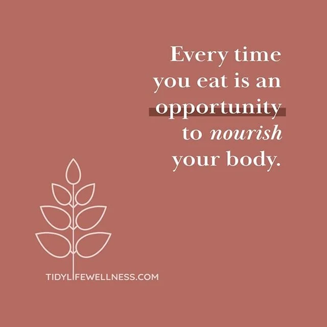
One of the main aspects of Tidy Life is its three-pronged, holistic approach to physical and mental health. This gave me an opportunity to create icons for each component-yoga (mind), nutrition (body), and de-cluttering (space)-that relate to the main logo. I kept it minimalist, to reflect the company’s philosophies, and used the leaves as a unifying element.
The color pallet went through many variations. It was important to keep the branding organic and light. Tidy Life’s clientele includes individuals, social groups, and corporations. Because of this, I wanted to avoid overly feminine tones. I also wanted to reflect the personal taste of each individual team member.
Mind
The design process for Wendy’s yoga icon was fairly straightforward. It needed to be easily identifiable, and the lotus flower is widely associated with yoga practice. My aim was for it to convey balance and peace, and I used the leaves from the main Tidy Life logo to assemble the image.
Body
Emily’s approach to nutrition is free of dieting fads and complicated systems. Her icon represents a return to basic ingredients.
Space
Full disclosure-I had a head start with Sue’s icon after coming up with the branding for Tidy Nest. I decided to just modify the logo I had already created by removing key elements and simplifying the nest itself. This process is what gave me the idea for Tidy Life’s main logo-I saw that I could use the leaves to build multiple shapes, and I liked the minimalist aesthetic of the branch.


